By The Design Company
•
November 8, 2025
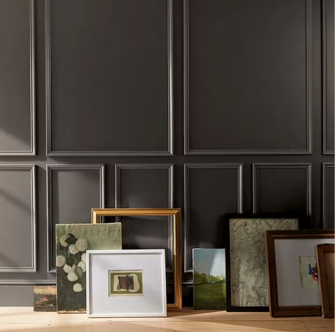
As we at The Design Company reflect on color trends that shape multifamily interiors and amenity spaces, we’re excited to spotlight the 2026 Color of the Year from Benjamin Moore: Silhouette AF-655. Here’s how we view this color through our developer-minded, design + value lens—and how it can play beautifully in multifamily settings. Benjamin Moore describes Silhouette as “an alluring mix of rich espresso hues with subtle notes of charcoal.” The significance for design and development? Timelessness over trend-chasing: Rather than a bright or fleeting hue, Silhouette is a deep, rich tone that anchors a space rather than distracting. Warmth with sophistication: The espresso-brown base counterbalanced by charcoal undertones gives it a velvety, luxurious feel. Ease of pairing: It acts as a neutral that can pair with trim, accent materials, metals, woods, textiles—making it flexible in multifamily interiors. Reflecting meaningful values: In our world of multifamily interiors, we’re seeing a pull toward durability, quality, and material story. A color like this helps tell that story. How The Design Company envisions using it? In our role specifying interiors for multifamily projects —clubhouses, corridors, amenity spaces, lobbies, resident homes—Silhouette offers both aesthetic and strategic advantages. Here’s how we’d leverage it: Anchor the “wow” moment – In a clubhouse lounge or lobby, drenching a wall (or even a ceiling) in Silhouette gives a sense of richness and gravity. When paired with lighter furniture, greenery, wood accents, you get maximum impact without cost-heavy detailing. Strong rental market positioning : Residents appreciate finishes that feel “luxury but lived-in.” Silhouette hits that sweet spot of premium without being cold or institutional. Millwork and built-in depth – Rather than painting everything white, using Silhouette for built-ins, cabinetry, accent millwork adds luxury feel and durability. It can hide wear and still read as refined. Contrast without harshness – In corridors or transition zones, a trimmed door in Silhouette against an off-white wall (say, Swiss Coffee OC-45) gives a layered, intentional feel—avoiding stark black/white contrast but still delivering sophistication. Residences that feel elevated – For apartments, using Silhouette on an accent wall (or open plan living zone) creates a premium finish, which supports rent-premium positioning and resident perception of value. Longevity & relevance: A well-chosen deep neutral won’t feel dated in two years; it supports longer-term asset value and reduced refresh cycles. Material friendly – Because its undertones lean warm but deep, Silhouette plays well with walnut, brushed bronze, travertine, patinated metals—so our furniture specs and finishes can align seamlessly. Why This Matters to You? At The Design Company, our mission is to blend strategic thinking + emotional design—we look to provide interiors that aren’t just beautiful, but that deliver operational value, resident appeal, and alignment with asset objectives. Choosing a colour like Silhouette AF-655 isn’t just about following a trend— it’s about choosing a colour foundation that supports your development goals. Whether you’re launching a new multifamily build, refreshing common areas, or specifying FF&E for units, integrating Silhouette (and its palette companions) gives you a design platform that: Elevates the resident experience Enhances perceived value of the property Supports material and lighting coordination Reduces risk of feeling “dated” in 2-3 years Allows for flexibility of furniture/finish refresh without full colour overhaul If you’re considering how to specify your next property’s interiors with longevity, appeal, and nuance, we encourage you to lean into Silhouette AF-655. At The Design Company we’re ready to guide you through specifying this palette, selecting furniture, finishes, lighting and wall treatments that bring it to life. Contact us at hello@thedesigncompany.net to start the conversation.